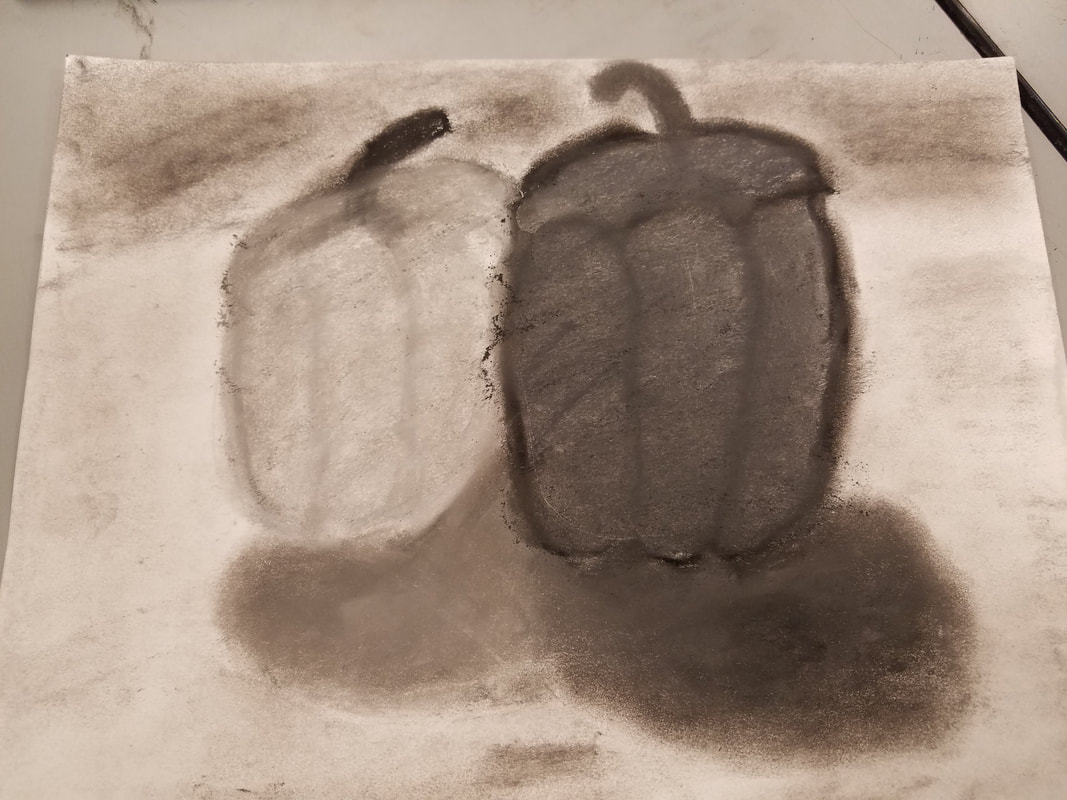
 This image is portraying one medium sized pepper next to a larger sized pepper. One pepper is darker an one is lighter. Both are casting shadows and the background is different shades of gray. The media I used for this project was a pencil, pastels, paper, and an eraser. A new skill we used was value. We had to make one pepper lighter and one darker, and we had to make a shadow in which one shadow was darker and one was lighter. These are great examples of value. It effected the drawing really nicely. This whole project represented value because we had to make certain things lighter or darker gray for effect, and so it looked close to the real picture of the peppers. We also used color to show the effect of parks being lighter and darker. A design element we used was contrast because we had to make certain things darker and lighter. The mood behind this piece is sadness, because all the colors are so grim and dark.
0 Comments
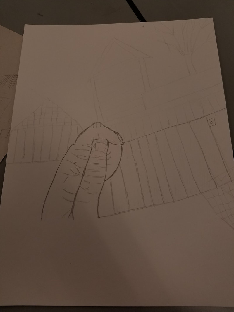 This is my choice drawing where I took a picture of anything I wanted and drew it. The main subject matter of my drawing is the hand in the middle. There is also houses, sheds, and fences in the background. The media I used were a pencil, an eraser, and paper. The new skill I learned but did not necessarily use was cross hatching. The main art elements I used were line, value, shape, and space. Line was used because you use lines to draw the shapes. Value because I had to make the shapes in the front layer of space look darker. I used space to show that some things were in front, and some things were in the background. For example the hand was in the foreground, and the houses and sheds were in the background. And for the third layer I had a tree. The mood is simplicity, because it is just a picture of a hand with simple things like a fence in the background.
My drawing is depicting leaves outside that I took a picture of. For this project I used a pencil and an eraser. A new skill I learned with this drawing was space because we had to use 3 different layers of space to make it jump out at you and look 3D. The main art elements were space, line, texture, and value. A design element I used was contrast because the leaves in the front are darker than the ones in the back for 3D effect. The art expresses realness because you are supposed to draw it as you see it. 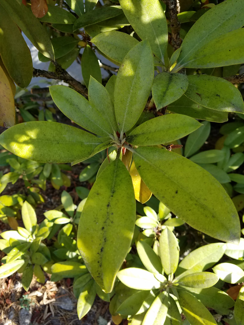 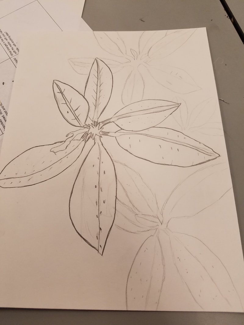 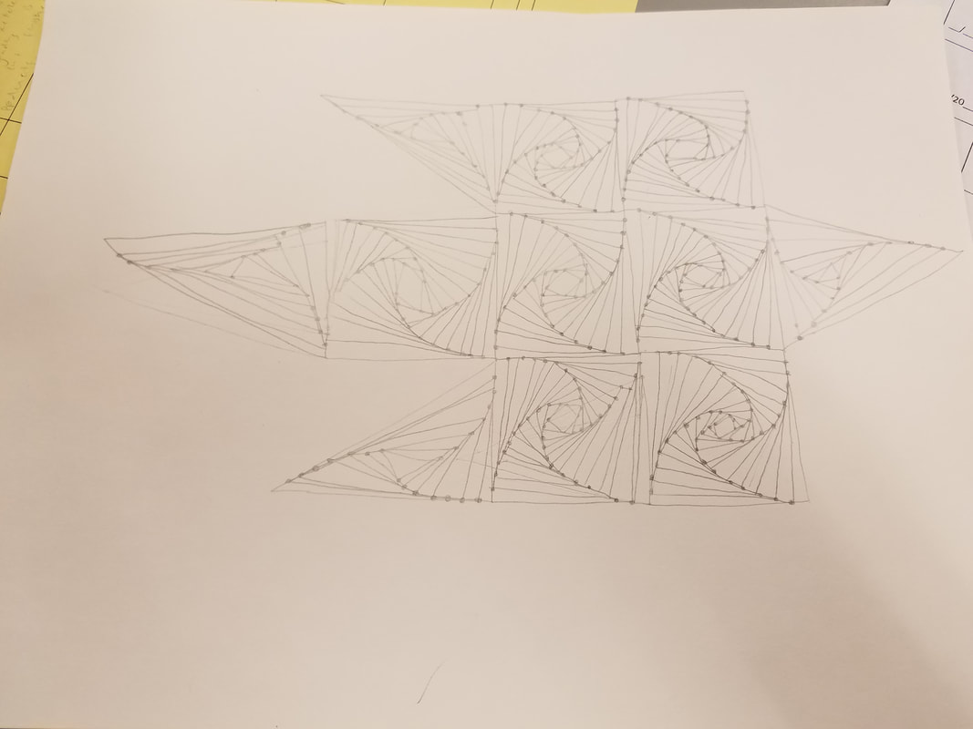 My image looks like an optical illusion. It is compromised of squares and triangles put together to make spirals and look like one big piece when its really several little shapes. With this drawing I used only a pencil and an eraser. I learned the skill of pushing and pulling lines. The most important elements I used were line and value. Obviously line because this is a line drawing and the lines were the core piece in the drawing. Value was also important because it gave a sort of 3D effect to the drawing. The most important design elements were pattern and movement. First there was a pattern to making the squares and triangles look as if they were spiraling which is why it was so important in this drawing. This pattern caused the shapes to move and blend together. The mood to me is unity because all the shapes are different in certain ways but in the end they all come together to look like one piece. The pattern allows for the shapes to look as if they are one because it allows them to all connect.
|
AuthorWrite something about yourself. No need to be fancy, just an overview. Archives
June 2018
Categories |
 RSS Feed
