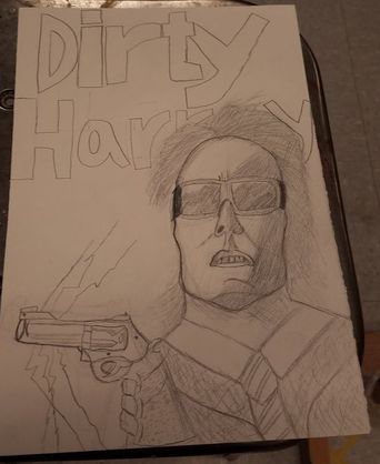
 This is a drawing I did portraying the cover for one of my favorite movies, Dirty Harry. For this I used a pencil, an eraser, and a piece of construction paper. The main art element for this project was value. One half of Harry's face is darker than the other, which gave the effect of him looking one way. The shadow under the chin gives the effect of him looking up slightly. The other main element in this drawing is space. I messed up and did not make enough space for the title letters, so I had to put part of it behind Harry's head. The mood behind this piece is stern, which is how Eastwood's character is like in the movie.
0 Comments
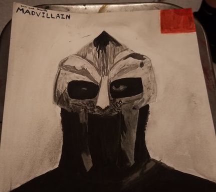 This is a painting I did of one of my favorite albums ever, Madvilliany. For this I used watercolors. The main skill that I used here was going from light colors to dark colors. The main art element used here is definatley value. I had to look at the album cover and paint the light colors and dark colors according to the original. The main design element is contrast. The values contrast each other for effect. The mood of this piece is greatness to me, because I get a feeling of how legendary this album is.
 This is a self portrait that I painted using acrylic paints, paintbrushes, and a canvas. The skill mainly associated with this project was darkening and lightening paint according to the values of the gray scale. The main art element represented by this project is value, because as I said before, we had to lighten and darken the paint according to values and shadows on the face. The main design element used here was contrast, because the different values of paint contrast very well. The feeling or mood of this project is unity, because all of the values and shapes come together to make one cohesive piece.
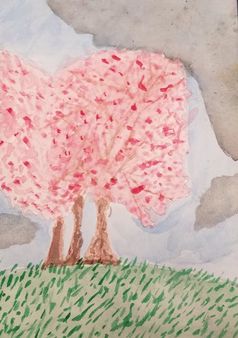 These are my paintings depicting cherry blossom trees at 3 times of a 24 hour period, morning, day, and night. The MEDIA I used for this project were watercolor paints, a pencil, and thick painting paper. The new skill I learned with this project were various water color techniques such as, wet on wet, wet on dry, patience when waiting for things to dry before adding new layers, and painting light to dark. The main art element used in this project was value. I had to make my watercolors exactly how the colors looked in the real life photo, because it needed to look natural. The main design element was contrast because the different values work well together to form one cohesive piece. The mood behind this project is change. 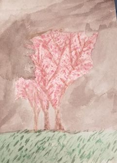 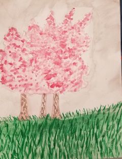
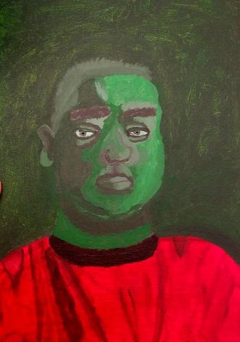
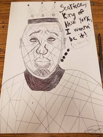 This is my drawing of on of the biggest rappers ever, Biggie Smalls. For this I used a pen and paper. The new skill I learned prior to this project was creating value by hatching and cross hatching. This was valuable because I had to use a pen, and unlike a pencil you cannot make different values very easily by pressing harder or lighter. The design element that relates to this is value. The mood behind this is greatness, because Biggie is an iconic rapper.
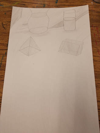 This is a drawing I did depicting a couple shapes and water vases that I arranged together in a certain way. The new skill I learned is making some object lighter or darker according to a gray scale version of the picture I took. This gave the drawing a 3D effect. The design element that relates to this that I used is contrast. Some shapes were darker, and some were lighter, and that contrasted very well. The mood behind this piece is simplicity, and peace.
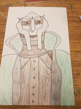 This is my first choice drawing of the second semester. For this I drew one of my favorite rappers. A sort of new skill I learned was shading. I used a lot of shading on his face. For the most emphasized art element I would pick lines. The whole picture is made up of lines. All the lines and shading came together in an attempt to make the rapper look as real as possible. I think the theme of this drawing is villainous.
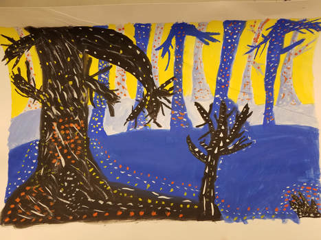 This is my painting portraying a spooky Forrest full of trees. The media I used was thick paper, a pencil, an eraser, paint and paintbrushes. The new skill we learned was things in the foreground are darker and more vibrant, and the things in the background are lighter and less vibrant. This new skill was applied to my painting. The main art elements I used were space and color. I made 3 layers of space so I could show how the colors go dark to light. This makes sort of a 3d looking space. I used complimentary colors to really make the 3d pop. The main design elements I used were contrast and emphasis. The complimentary colors I used contrast each other very nicely. For example the orange dots compliment the blue trees nicely. I used the dots to put emphasis on the trees, and their 3d figure. The mood of this piece is somber and spooky, due to the dark colors and the scraggly trees.
|
AuthorWrite something about yourself. No need to be fancy, just an overview. Archives
June 2018
Categories |
 RSS Feed
