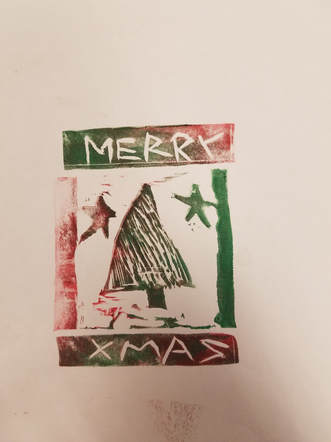
 This is a block print design I made. As you can see it is Christmas themed with the tree, stars, and "Merry Xmas". For this project I used a linoleum block, block cutters, paint, paint rollers, paper, and a tray to roll out the paint on. The main art elements I used in this piece were color and texture. I used color because I had to figure out which colors would look good together for Christmas. Green and red are complementary and look great together. I used texture by cutting small slits in the tree to make it look more life like. The main design elements I used were contrast emphasis. Contrast was used because green and red contrast each other very nicely. For emphasis I made the tree the biggest thing and put it right in the center to really emphasize that it is Christmas time. The theme for this project was definable Christmas.
0 Comments
This is a drawing portraying the shoes that I wear every single day. I used a dip pen with fine nib, paper, ink, and a piece of paper. The new skill we learned was texture. I used the dip pen to make hundreds of little circles that came together to show the texture of the threads on the shoe. The main art elements for this piece are texture and line. I pulled the lines towards me to make the general shape of the shoe. Texture was used by making all the little circles, which showed the texture of the shoe thread. The main design elements are pattern and unity. Pattern was used to make the little circle texture, while unity was used to make all the circles come together and look like the actual texture on my shoe. The theme of this drawing is reality because I had to make the picture look like a realistic shoe, and I believe I accomplished that.  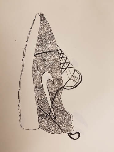
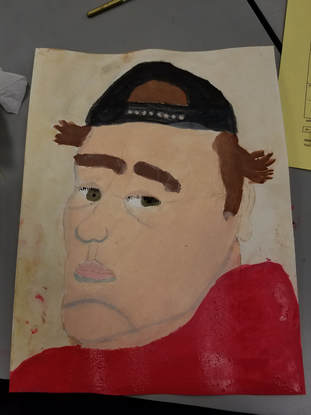
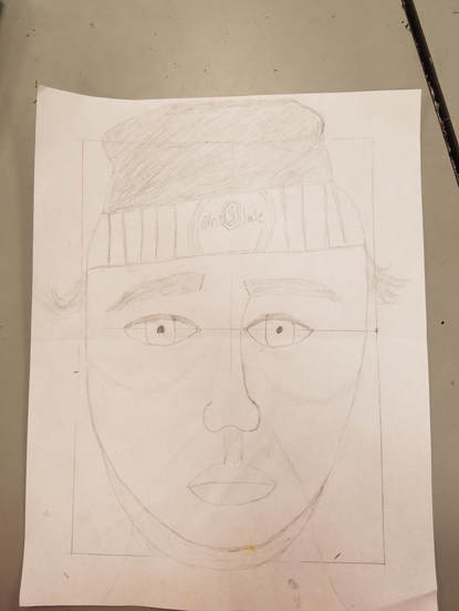
This is a painting portraying my face from a somewhat side angle view. For this I used a pencil, an eraser, different colors of paint, and paper. The new skill I learned was color matching, because the colors of my original selfie match very well with my painting. The main art elements that are present are color and contrast. I used color to make the painting look accurate to my selfie, and the colors contrast each other very nicely. The main design elements I used were proportion and scale. I did this so the painting would look life like, and not like an alien ha ha. For example I made the nose in direct proportion to my lips by looking at my selfie and using the grid. The feeling of this painting is somber, because in my selfie I have a very neutral expression, and that is usually construed as somber or sad.
This is a drawing portraying myself. I did this by simply using a pencil, paper, and an eraser. For this project I learned the skills of scale and proportion. I had to use this to actually make my drawing look like a real human, more importantly, me. I did this by splitting up the face into 4 separate dimensions. The main art elements that are present in my drawing are shape and line. All the parts of my face are different shapes, and I had to take that into account when drawing this. I used Line to make all of these shapes. The main design elements were proportion and scale. As mentioned before I used these to make myself look like an actual human. For example for the eyes, I made one eye on one side of the grid, and then used an imaginary eye in the middle to figure out where on the other side to draw the other eye\, because that is generally how far apart eyes are on the human face. All the components and shapes in this drawing came together to represent my own face. I think the feeling of this drawing is unity, because all the separate parts come together to make one whole face.
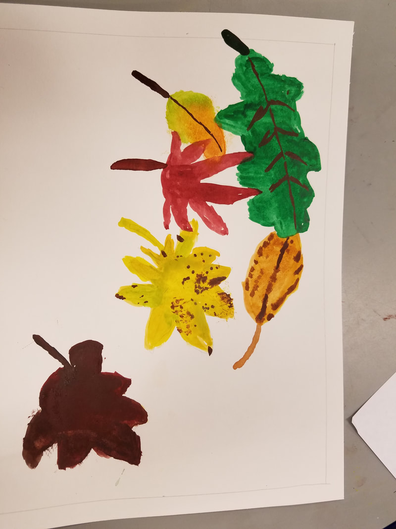 This is a painting depicting leaves I found outside, arranged in a way that I thought looked good. The media I used was a water color paint set, 1 big brush, 1 small brush, paper, a pencil, a ruler, and an eraser. We had never used water colors before, so we learned how to blend colors to get an exact color we needed for a certain leaf. The main art element we used was color, because we had to use the paint to show how each of the leaves was a different color, and we had to get the perfect shade for each leaf. The main design element we used was contrast, because all of the leaves are different colors so they contrast one another. I think the mood of this painting is sadness and happiness, because some of the colors are lighter and happier, and some are darker.
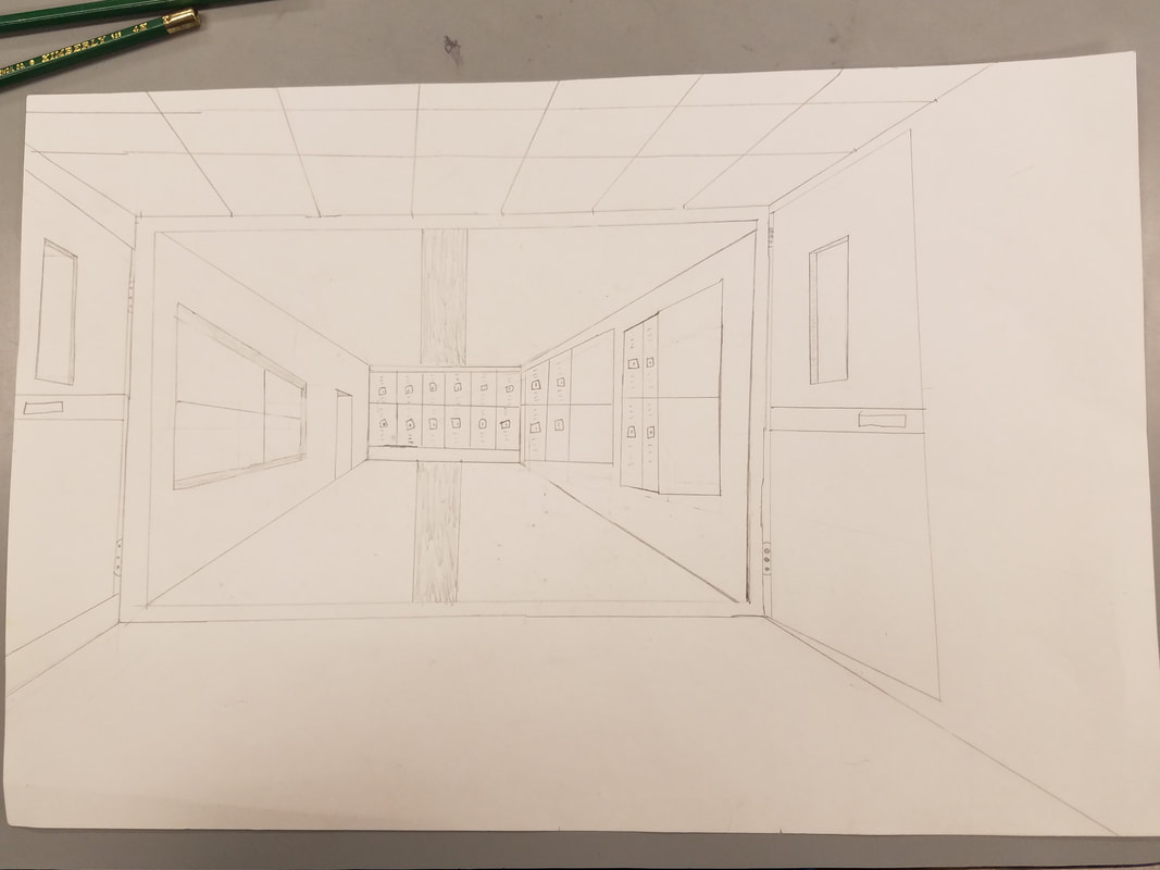 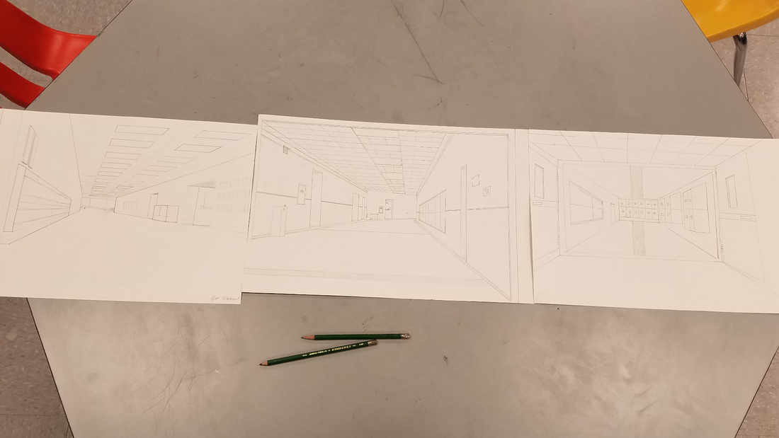 This is a drawing depicting our hallway at our school. The media I used was, a pencil, an eraser, a ruler, and a drawing board. A new skill I learned was point perspective. We put a point on the back wall of the hallway representing where we were in said hallway, and drew everything in 3D relativity to that point. Everything had to line up with the point. Another element I used was value, because I made the objects in the foreground darker, and the ones in the background lighter for a 3D effect. This same effect can also be connected to the element contrast. The mood of this project to me is unity, because everything looks different, but is drawn in relativity to the vanishing point, which makes everything connected.
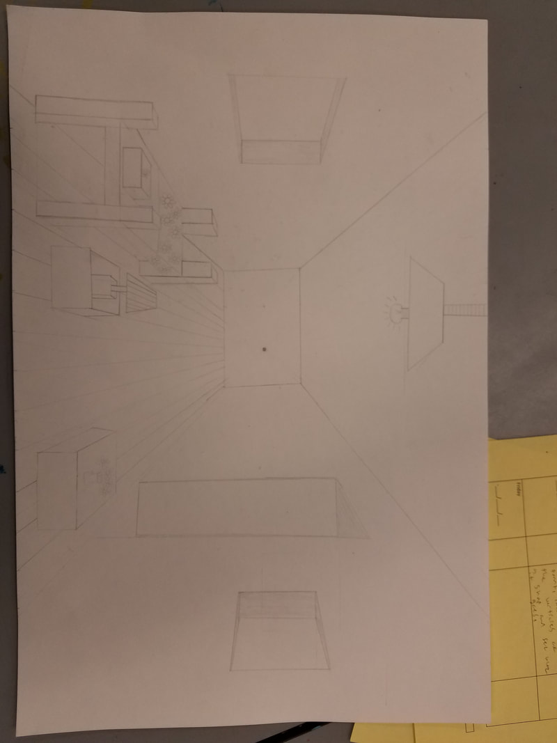 This drawing is portraying a room. The media I used was a ruler, a pencil, and an eraser. The room has a bed, a nightstand with a lamp, a table with a pot of flowers, 2 windows 1 door, and a sky light. The new skill we learned with this drawing was one point perspective. Basically the point is where you are in the room, and you draw everything in relativity to that. You have to make all vertices line up with the vanishing point, even the floor panels. The art elements we used were space, shape, line, and form. These all translate into proportion/scale. The mood of this drawing is simpleness because while it is simple, there is beauty in it.
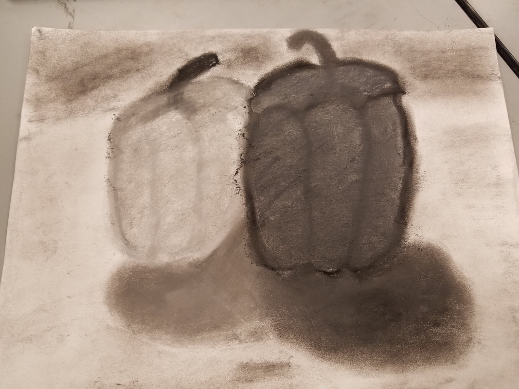 This image is portraying one medium sized pepper next to a larger sized pepper. One pepper is darker an one is lighter. Both are casting shadows and the background is different shades of gray. The media I used for this project was a pencil, pastels, paper, and an eraser. A new skill we used was value. We had to make one pepper lighter and one darker, and we had to make a shadow in which one shadow was darker and one was lighter. These are great examples of value. It effected the drawing really nicely. This whole project represented value because we had to make certain things lighter or darker gray for effect, and so it looked close to the real picture of the peppers. We also used color to show the effect of parks being lighter and darker. A design element we used was contrast because we had to make certain things darker and lighter. The mood behind this piece is sadness, because all the colors are so grim and dark.
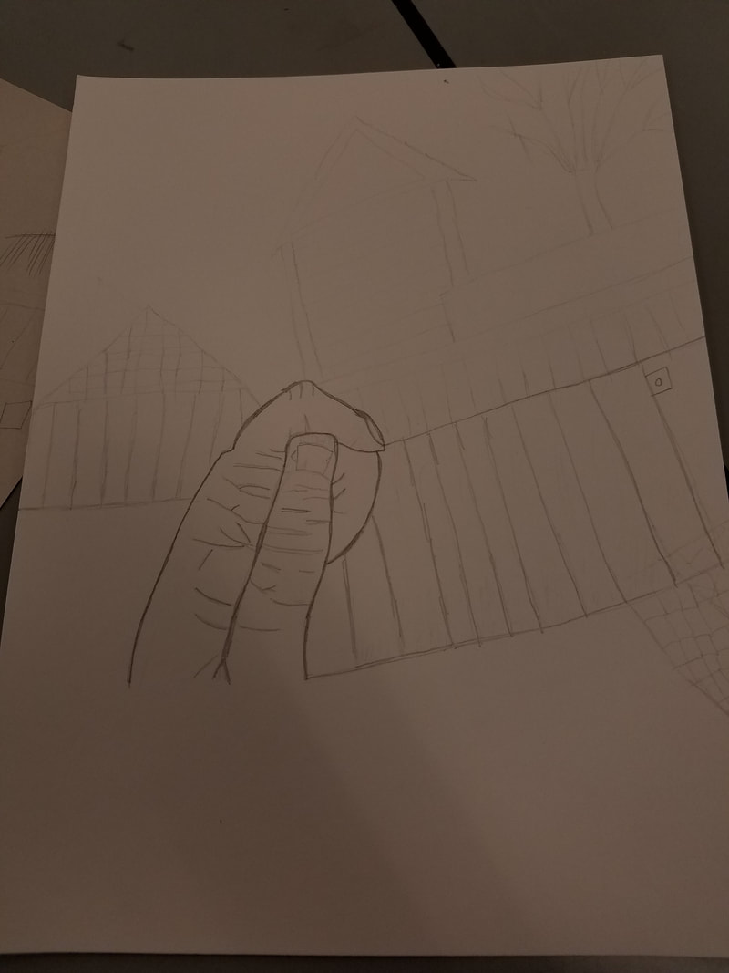 This is my choice drawing where I took a picture of anything I wanted and drew it. The main subject matter of my drawing is the hand in the middle. There is also houses, sheds, and fences in the background. The media I used were a pencil, an eraser, and paper. The new skill I learned but did not necessarily use was cross hatching. The main art elements I used were line, value, shape, and space. Line was used because you use lines to draw the shapes. Value because I had to make the shapes in the front layer of space look darker. I used space to show that some things were in front, and some things were in the background. For example the hand was in the foreground, and the houses and sheds were in the background. And for the third layer I had a tree. The mood is simplicity, because it is just a picture of a hand with simple things like a fence in the background.
My drawing is depicting leaves outside that I took a picture of. For this project I used a pencil and an eraser. A new skill I learned with this drawing was space because we had to use 3 different layers of space to make it jump out at you and look 3D. The main art elements were space, line, texture, and value. A design element I used was contrast because the leaves in the front are darker than the ones in the back for 3D effect. The art expresses realness because you are supposed to draw it as you see it. 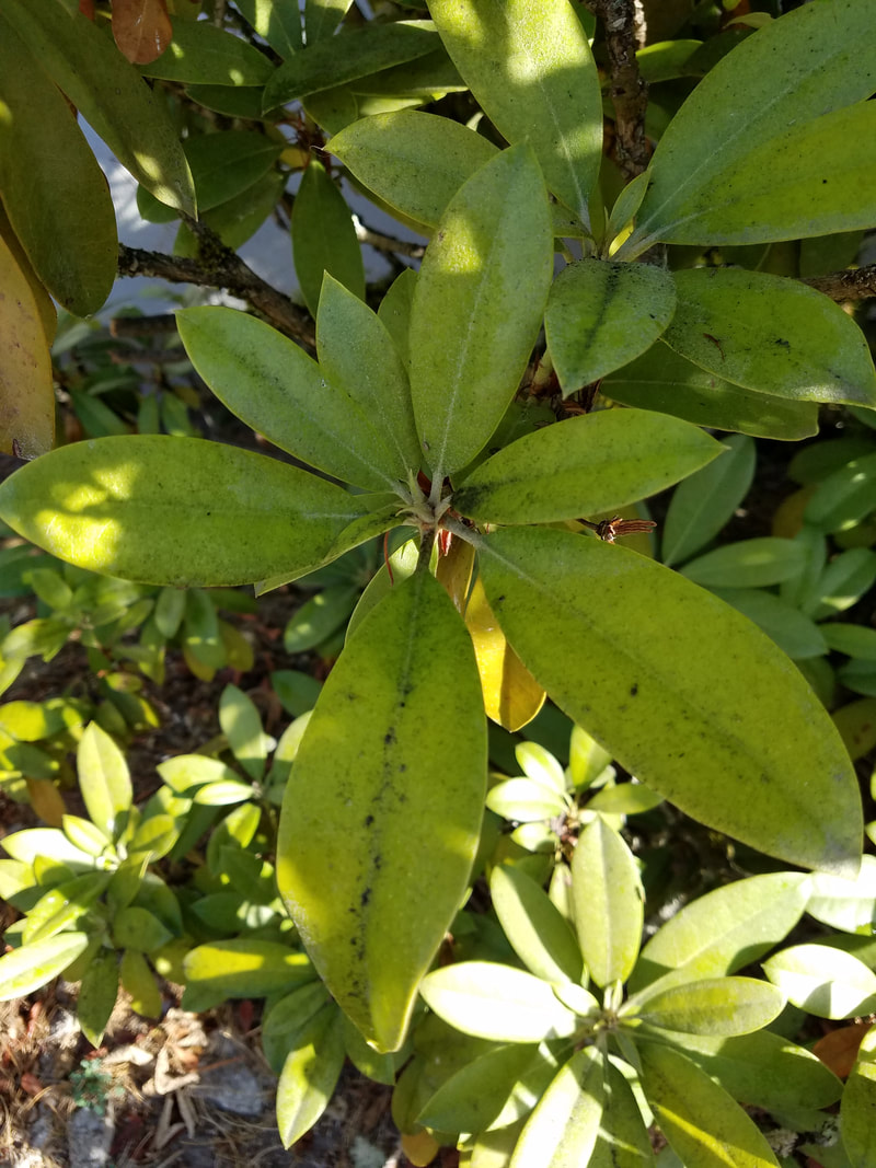 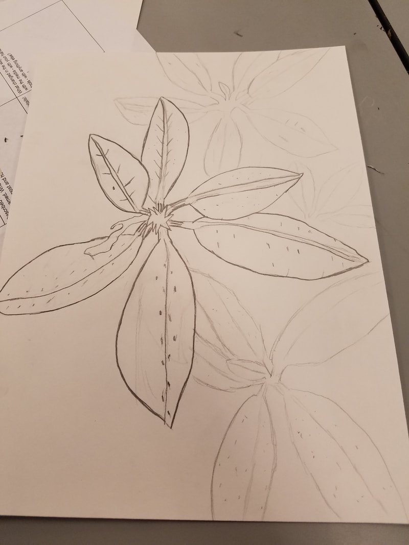 |
AuthorWrite something about yourself. No need to be fancy, just an overview. Archives
June 2018
Categories |
 RSS Feed
