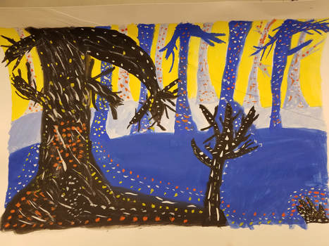
 This is my painting portraying a spooky Forrest full of trees. The media I used was thick paper, a pencil, an eraser, paint and paintbrushes. The new skill we learned was things in the foreground are darker and more vibrant, and the things in the background are lighter and less vibrant. This new skill was applied to my painting. The main art elements I used were space and color. I made 3 layers of space so I could show how the colors go dark to light. This makes sort of a 3d looking space. I used complimentary colors to really make the 3d pop. The main design elements I used were contrast and emphasis. The complimentary colors I used contrast each other very nicely. For example the orange dots compliment the blue trees nicely. I used the dots to put emphasis on the trees, and their 3d figure. The mood of this piece is somber and spooky, due to the dark colors and the scraggly trees.
0 Comments
Leave a Reply. |
AuthorWrite something about yourself. No need to be fancy, just an overview. Archives
June 2018
Categories |
 RSS Feed
